
 By
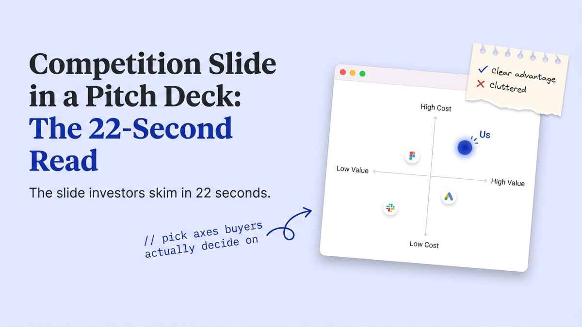
The competition slide is the page in a pitch deck where you show the other ways a customer could solve their problem today, and why you win anyway. It usually sits near the solution and market-size slides. Here’s what most guides skip: investors give it about 22 seconds, the least of any major section, per DocSend’s 2024 data compiled by PitchGrade. We review founder decks before they raise, and this is the slide people either over-build with fifteen logos or skip out of fear. Both misreads cost the same thing.
What is a competition slide, really?
A competition slide maps the real alternatives your customer has and argues you’re the better one. That’s the surface job. Underneath, it’s a self-awareness test. An investor reads it to check whether you understand your own market, not to admire that you win every row.
So the slide answers two questions at once. Who else is chasing this, and why won’t they crush you once they notice? Get the first wrong and the second doesn’t matter.
There are two kinds of rivals to show. Direct competitors solve the same problem the same way you do. Indirect ones solve it differently, and founders forget them constantly. If you sell budgeting software, a rival app is direct; a shoebox of receipts and a Sunday-night spreadsheet is indirect, and it’s winning right now in millions of homes.
The weak slides we see treat this page as a trophy case. Every competitor gets a small logo and a red X, and the founder gets a big logo and green checks down the line. It feels great to build. It convinces no one, because no investor believes a market where you’re perfect and everyone else is useless.
Why does “we have no competitors” kill your pitch?
“We have no competitors” kills your pitch because it reads as naivety, not as a wide-open market. Investors have seen the line a thousand times, and it signals you haven’t looked hard enough or you don’t grasp how buyers cope today. Remember, “no market need” still tops CB Insights’ list of why startups fail. A founder who can’t name the alternatives usually hasn’t proven the pain.
Every problem worth funding already has a workaround. Your job is to name it. Here’s what your real competitor usually is:
- The status quo: a spreadsheet, a manual process, or doing nothing at all. This wins more deals than any funded startup.
- The incumbent’s “good enough”: a big player’s half-feature that’s already installed and paid for.
- The in-house build: your buyer deciding their own team can hack it together.
- The adjacent tool: something bought for another job that customers stretch to cover yours.
Name the status quo as competitor one and you flip the whole slide. Now you look like a founder who’s talked to buyers and knows exactly what you’re replacing. My honest take after hundreds of reviews: the strongest competition slides lead with “here’s what people do today,” because that’s the rival investors actually fear you can’t beat.
There’s a quieter benefit too. Once you admit the alternatives, your differentiation has something to push against. “Faster than a spreadsheet” is a claim you can defend. “Better than nothing” is not.
How long do investors spend on the competition slide?
Investors spend about 22 seconds on the competition slide, the least of any major section, according to DocSend’s 2024 breakdown via PitchGrade. Compare that to 1 minute 2 seconds on the team slide and 52 seconds on financials. The whole deck gets 3 minutes 44 seconds on a first read. This page is a rounding error inside a rushed skim.
That reality should change how you build it, and we keep seeing founders design this page for a reader who never shows. Papermark’s 2024-2025 report, drawn from 3,000 decks and over 8 million data points, found nearly half of decks (49%) run 9 to 16 pages and that readers give each page roughly 15 seconds after the first. Nobody is studying your fifteen-logo grid. They’re catching a shape and a headline, then moving on.
Common mistake
Cramming the least-read slide with the most detail. The competition page gets about 22 seconds (DocSend, 2024), yet founders pack it with fifteen logos and a twelve-row matrix. Nobody parses it. Cut to the four rivals that matter and one clear reason you win.
So the test is brutal and simple. If a reader can’t get your point from the title and one glance at the graphic, the slide failed. You don’t get the careful second read you designed for. You get 22 seconds and a scroll.
Not sure your competition slide lands in one glance? Get slide-by-slide feedback before you send.
Which competition slide layout works: 2x2, matrix, or petal?
The layout that works is the one whose axes or columns name what customers actually decide on. That’s the whole game, and it’s where most founders quietly cheat. Slidebean calls the magic quadrant the most recognized format for a reason: a well-built 2x2 lands in the two seconds you’ve got. A rigged one lands too, just not the way you hoped.
Here’s the trap I flag every week. A founder picks the two axes where they sit alone in the top-right corner. “AI-powered” and “affordable,” say, when customers actually buy on reliability and integrations. The grid looks like a win and reads like a dodge, because a sharp investor knows the axes were chosen to produce that dot. Pick the two dimensions your buyers argue about, even when one of them isn’t your strength.
| Layout | Works when | The trap |
|---|---|---|
| 2x2 quadrant | Two buying criteria dominate | Axes picked to park you top-right |
| Feature matrix | Buyers compare specific capabilities | Every row green for you, so nobody believes it |
| Petal or map | Many players across categories | Looks busy, says almost nothing in 22 seconds |
| Simple list | Very early, few real rivals | Reads as a step you skipped |
The 2x2 and the feature matrix cover most decks. Use the quadrant when two criteria really drive the choice, and pair it with a one-line “why we win” so the graphic isn’t doing all the work. Use the matrix when buyers genuinely compare capabilities, but keep it to four or five rows. The petal diagram looks sophisticated and communicates the least, so skip it unless your category truly has many overlapping players.
StartWise's position
A deck dies in the first 90 seconds of a skim, so build the competition slide for the skim first. If the title states your edge and the graphic confirms it at a glance, you pass. If a reader has to study a twelve-cell grid to see why you win, you've already lost the fast readers, who are most of them.
The comparison table that actually builds trust
The comparison table that builds trust is the one that admits where you lose. When every row is green for you and red for everyone else, an investor stops reading it as data and starts reading it as marketing. The table meant to prove your edge ends up proving you’re not a fair narrator.
A table where you win every row isn’t a comparison. It’s a self-portrait.
The fix costs you nothing and buys you credibility. Give one competitor a genuine win. “Bigger integration library,” “cheaper at enterprise scale,” “longer track record,” whatever’s true. One honest concession makes the rest of your claims believable, because now the reader trusts you to tell them the bad with the good.
This is the same honesty that carries a good traction slide: investors reward founders who show the real numbers, not the flattering ones. We see the pattern hold across every deck we review. The founder who says “they beat us on X, and here’s why customers still switch” sounds like an operator. The one with a wall of green checks sounds like a brochure.
Where does the competition slide go in your deck?
The competition slide goes after your solution and product slides and near the market-size slide, usually about two thirds of the way through a standard pitch deck template. By then the investor knows what you do, so the natural next question is who else does it and why you win. Answer it right where they ask it.
Keep it to one slide. We sometimes see it buried at the very end, after the ask, where it reads like an afterthought the founder tacked on. It pairs with your market sizing: the market slide says the opportunity is big, and the competition slide says you can take a real share of it. Two slides, one argument.
What to do this week
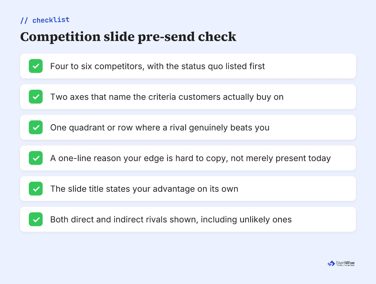
Rebuild your competition slide in one sitting, in this order, then test it against the clock. It’s the sequence I run when we review one, and it matches how little time the slide actually gets from investors.
- List the alternatives, and put the status quo first. Spreadsheet, doing nothing, or an incumbent’s good-enough.
- Pick two axes customers really decide on, even if you don’t win both.
- Cut the grid to four to six rivals. If it needs fifteen, you haven’t chosen.
- Concede one real win to a competitor. Trust goes up, not down.
- Write a title that states your edge on its own, then read only the title.
Then show it to someone for exactly 22 seconds and take it away. Ask them who wins and why. If they can tell you, the slide works. If they squint and start reading the small cells, you’ve built for a reader who was never going to show up.