
 By
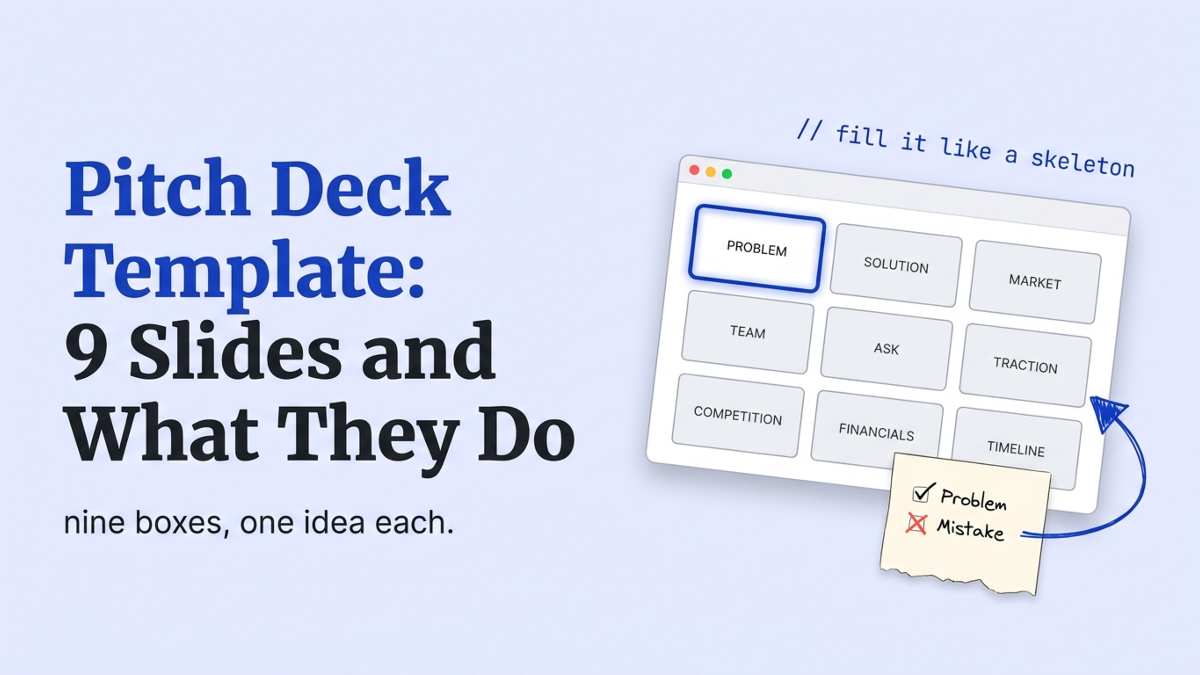
A pitch deck template is a pre-built set of slides you drop your story into: problem, solution, market, team, ask, and a few more. Download one from Canva or Slidebean and you’ll get clean layouts and empty boxes. What you don’t get is the harder part, which slide does what job and what to write in it. We review founder decks before they go out. The most common problem isn’t a bad template. It’s a good template filled box by box, with no argument running through it.
What slides go in a pitch deck template?
A working template has nine slides, in this order: cover, problem, solution, why now, market, traction, business model, team, and ask. That’s the skeleton behind almost every funded pre-seed deck we see. In one 2026 sample, 32 of 40 founders who closed rounds between $250K and $2M used this structure or a close variant, according to Slide Gamma’s pre-seed playbook.
Nine is a starting point, not a rule. Some decks add a competition or roadmap slide. Papermark’s 2025 report, built on 3,000 decks, found 49% run between 9 and 16 pages, the most common band by a wide margin.
Start at nine, and you’ll add only what earns its place.
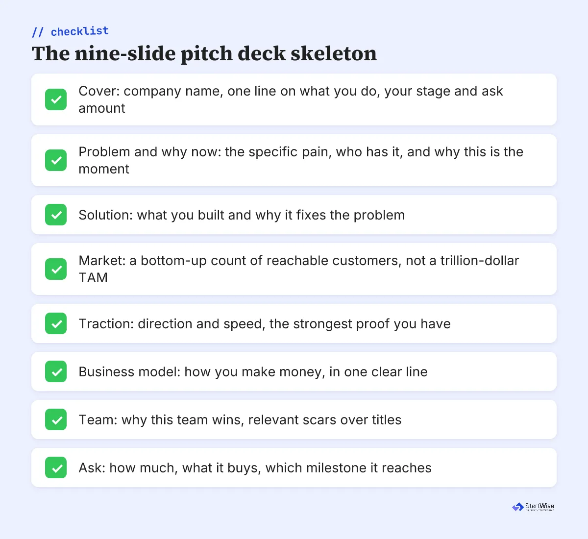
This is the same backbone you’ll see in most pitch deck examples worth studying. The famous decks vary the labels. They almost never vary the underlying order.
Why is a template a skeleton, not a script?
A template gives you the skeleton. It doesn’t hand you the script, the argument that ties one slide to the next. This is where we keep seeing templates hurt founders: every slide gets an equal-sized box, so every slide gets equal effort, and the deck flattens into nine disconnected claims.
An investor reads it in the order you’ve built it, fast. Papermark clocked about 23 seconds on the first slide and 3.2 minutes on the whole deck.
That’s a skim, not a study.
A good template filled box by box is still a bad deck.
StartWise's position
Decks die in the first 90 seconds of a skim. Build so your slide titles alone tell the story, then let the body prove it. A template that only makes sense when you narrate it is a deck that falls apart the moment an investor opens it without you in the room.
Read your titles top to bottom, ignoring everything else. If that alone tells a coherent story, the skeleton is doing its job. If it reads like a table of contents, you’ve filled boxes.
What does each slide need to do?
Each slide has exactly one job, and the template’s equal boxes hide that from you. Here’s the job for the five slides that decide most pre-seed meetings, plus the box-filling mistake we flag on each.
The problem slide’s job is to make an investor feel a pain they already recognize. The box tempts you to describe your product category instead. Skip that. Name the person, the moment the pain bites, and the clumsy workaround they use today. If a reader nods before they’ve seen your solution slide, this slide worked.
The market slide’s job is to show a believable path to real revenue. The template’s giant total-addressable-market number invites a top-down fantasy. A bottom-up count of customers you can actually reach in year one beats any trillion-dollar figure. Our full walk-through of a TAM SAM SOM example shows the math investors trust.
The traction slide’s job is to show direction and speed. Founders drop a single absolute number in the box, like “1,200 signups,” and stop. At pre-seed, a slope beats a total every time: week-over-week growth with a mechanism an investor can believe. There’s more on what belongs on the traction slide, including the cumulative-chart trap that hides a stalling business.
The team slide’s job is to answer one question, why this team wins. The box invites a resume dump of logos and degrees. Relevant scars answer better than titles: you shipped the hard thing, sold to this buyer, or lived the problem for years.
The ask slide’s job is to name a number tied to a milestone. The box accepts “$500K to accelerate growth,” which is wallpaper. Tie it to a milestone. “$600K for 18 months of runway to reach $40K MRR” is an ask. It tells an investor what their money buys and what de-risks the next round.
Filled in every box but not sure the story holds together? Get a slide-by-slide read before an investor gives you one.
How does the template change from pre-seed to seed?
The skeleton stays the same from pre-seed to seed.
The content emphasis flips. A pre-seed deck sells potential, so it leans on problem, team, and a sharp market insight. A seed deck sells early proof, so traction and unit economics move to the front and carry more weight.
The clearest split is financials. A pre-seed template needs no projections slide, and SAFEs made up 93% of pre-seed rounds in Q1 2026, per Carta’s data via Flux, so investors are underwriting the person, not a P&L. By seed, a short projections slide earns its place, with the working model in your data room. Our guide to the financials slide of a pitch deck covers what stays on the slide versus what stays in the model.
| Element | Pre-seed template | Seed template |
|---|---|---|
| Traction slide | Soft proof: LOIs, waitlist, prototype | Metrics: revenue, retention, growth rate |
| Financials | No projections slide | Short projections, model in data room |
| Market | Insight and “why now” | Insight plus early validation data |
| Slide count | 9 to 10, kept tight | 11 to 12, more proof to show |
Round sizes are shifting under both stages. Carta found $1M to $2.5M rounds fell from 24% of pre-seed deals in Q1 2023 to 18% in Q1 2026, so match your ask slide to what you’re actually raising now. For the full stage playbook, our pre-seed pitch deck examples annotate real decks slide by slide.
Three slides to cut from the template you downloaded
Most templates ship with slides that pad the count without adding proof, and cutting them is the fastest win. Every slide you remove gives your problem and team slides more of that 3.2-minute skim.
Three cuts pay off most:
- The exit-strategy slide at pre-seed. Talking about your acquisition before you have a product reads as putting the cart miles ahead of the horse.
- The competition quadrant when it’s just your logo in the top-right corner with rivals scattered below. Investors see through a chart built to flatter you.
- The second roadmap slide, when your “milestones” and “roadmap” slides say the same thing twice.
The template trap
A template's biggest risk is that it makes a full deck feel finished. Nine filled boxes look complete, so founders stop editing exactly when the real work, cutting to the sharpest version, should start.
My honest take after reviewing decks: the strongest pre-seed decks are shorter than the template suggests, because the founder had the confidence to delete. When you’re deciding how the whole raise fits together, our 12-week guide to raising a pre-seed round puts the deck in context.
What to do this week
Open your template and make three passes, in order:
- Read only the slide titles, top to bottom, and check they tell the story on their own.
- On every slide, write the one job it does in the notes, then delete anything that doesn’t serve that job.
- Cut your deck to nine or ten slides and see what breaks.
Then hand it to someone who’s never heard your pitch and give them three minutes, no narration. You’ll learn more from their blank look than from any template. What they can’t explain back is what your template let you hide, and the decks we see improve most when the founder fixes that gap by cutting, not adding. And remember the deck rarely arrives cold: it usually follows an investor one-pager that earned the open first.