
 By
By 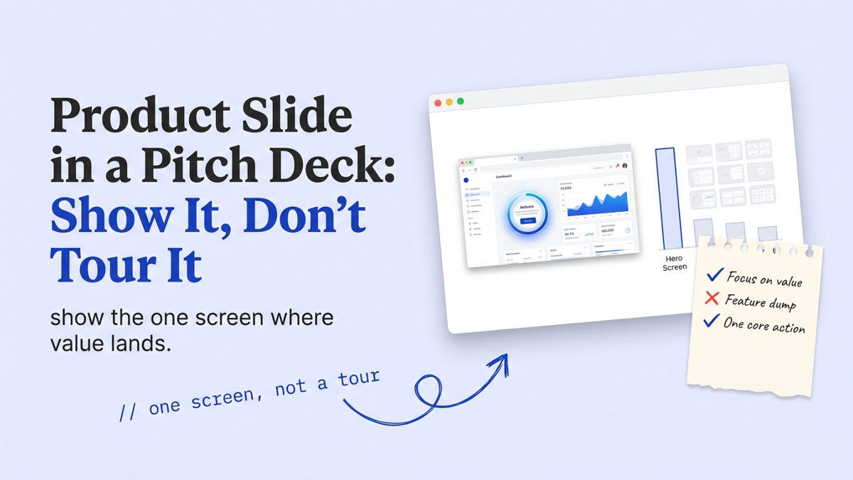
The product slide is where your deck stops describing an idea and starts proving you built something real. It sits right after the solution slide and answers one blunt question every investor asks before they lean in: does this thing actually exist, and what does it do the moment someone opens it? We review pitch decks every week, and the product slides we flag almost never fail on design. They fail because they tour twelve features. Papermark’s 2024 analysis of 3,000 decks found investors give each slide about 15 seconds.
A screenshot grid burns that on nothing.
What is the product slide in a pitch deck?
The product slide is the slide that shows what you built and how it works, right after the solution slide names your approach. Think of the solution slide as the promise and the product slide as the receipt. One argues the idea is right.
The other proves you can ship it.
In the review room we see founders confuse the two constantly. The solution slide sells the thesis, the eureka moment Sequoia tells you to explain. The product slide has a narrower job: make the thing concrete. Show the interface, the core flow, the moment a user gets value. If a reviewer finishes your product slide still unsure whether the product exists, the slide failed at the one task it had. In a standard nine-slide deck, it is the slide that turns a story into a company.
What should a product slide include?
A product slide should include four things and nothing else. One hero screen, a one-line statement of what it does, two or three capabilities that set it apart, and one piece of proof it works. That is the whole brief.
- The hero screen: the single view where your product delivers its core value, shown at a size a reader can actually parse.
- What it does: one sentence a non-user understands, tied to the pain from your problem slide.
- Two or three differentiators: the capabilities a competitor can’t copy this quarter, not a full feature list.
- One proof point: a live metric, a pilot result, or a working link that says this runs today.
The decks we score highest keep this slide almost empty. That isn’t a design preference. A full 9 to 16 page deck, which is 49% of the decks Papermark measured in 2024, still gives each slide seconds, so every extra screenshot steals attention from the one that matters.
Solution slide vs product slide: what is the difference?
The difference between the solution slide and the product slide is promise versus proof. The solution slide states the thesis in words. The product slide shows the built thing in pixels. Sequoia’s canonical template skips a product slide entirely and folds it into Solution, which is exactly why first-time founders merge them and dilute both.
| Slide | Its one job | What goes on it | The failure mode |
|---|---|---|---|
| Solution | Argue the approach is right | The thesis, the insight, the status quo you beat | A feature list posing as a thesis |
| Product | Prove the approach is built | One hero screen, what it does, proof it runs | A twelve-feature tour nobody reads |
My honest take: if you only have room for one slide, keep the product slide and bake the thesis into its title. A reviewer will forgive a thin argument faster than a fuzzy product.
Show the product, don’t tour it
Showing the product means picking the one screen where value lands and building the slide around it. A tour means marching a reader through nine thumbnails, and at roughly 15 seconds a slide (Papermark, 2024) they see a blur. Pick the magic moment. The click, the result, the before-and-after that made your first user say oh, that is useful.
Investors are paying more attention here than most founders assume. Even in DocSend’s 2020 data, the time investors spent on the product-readiness section of pre-seed decks had jumped 46% year over year, and the decks that raised surfaced the product earlier than the decks that didn’t. The product slide isn’t a formality you rush past. It’s where a skeptical reader decides whether to keep reading.
StartWise's position
Most product slides we flag look sharp. They're just crowded. A fundable product slide shows the single screen where value lands and proves the thing runs today. Everything else on it is delaying the reviewer from the one image that would sell them.
A screenshot grid is not a product slide. It is a product slide apologizing for not knowing which screen matters.
Not sure which screen earns your product slide?
Screenshots or mockups: what belongs on the slide?
Use a real screenshot of the working product whenever you have one. At pre-seed, a polished mockup of a product you haven’t built yet is the most common vaporware tell we flag. It looks finished, and a sharp investor will ask to see it live in the meeting. A clean screenshot of a rough real screen beats a beautiful render of a fiction.
Mockups earn their place in two cases. You’re pre-product and pitching a design-led wedge, or you’re showing a near-term feature you’ve specced but not shipped, clearly labeled as coming. Frame real screens simply, too. A browser or device frame is fine. Heavy 3D staging isn’t, because it reads as marketing, and a reviewer discounts marketing on sight.
43%
of failed startups never found product-market fit (CB Insights, 2026, 431 companies). Investors probe the product slide first for that risk, so a mockup that looks shipped but isn't invites the one question you can't dodge: can I try it now?
How the product slide changes from pre-seed to seed
The product slide changes from proof of insight to proof of usage as you move from pre-seed to seed. At pre-seed you may have a prototype or a single working flow, and that is enough if the slide shows real usage or a design partner leaning on it. The job there is to make your wedge feel real and wanted.
By seed, we expect a shipped product on this slide and evidence people keep coming back. Show the core screen plus one usage or retention signal, then let the traction slide carry the growth curve. This is where product and market meet. Poor product-market fit killed 43% of the failed startups CB Insights studied in 2026, and reviewers know it, so they read your product slide as an early tell for that risk. A reviewer only spends about 3.2 minutes on the whole deck (Papermark, 2024), and by seed they want that time buying proof, not promises.
What to do this week
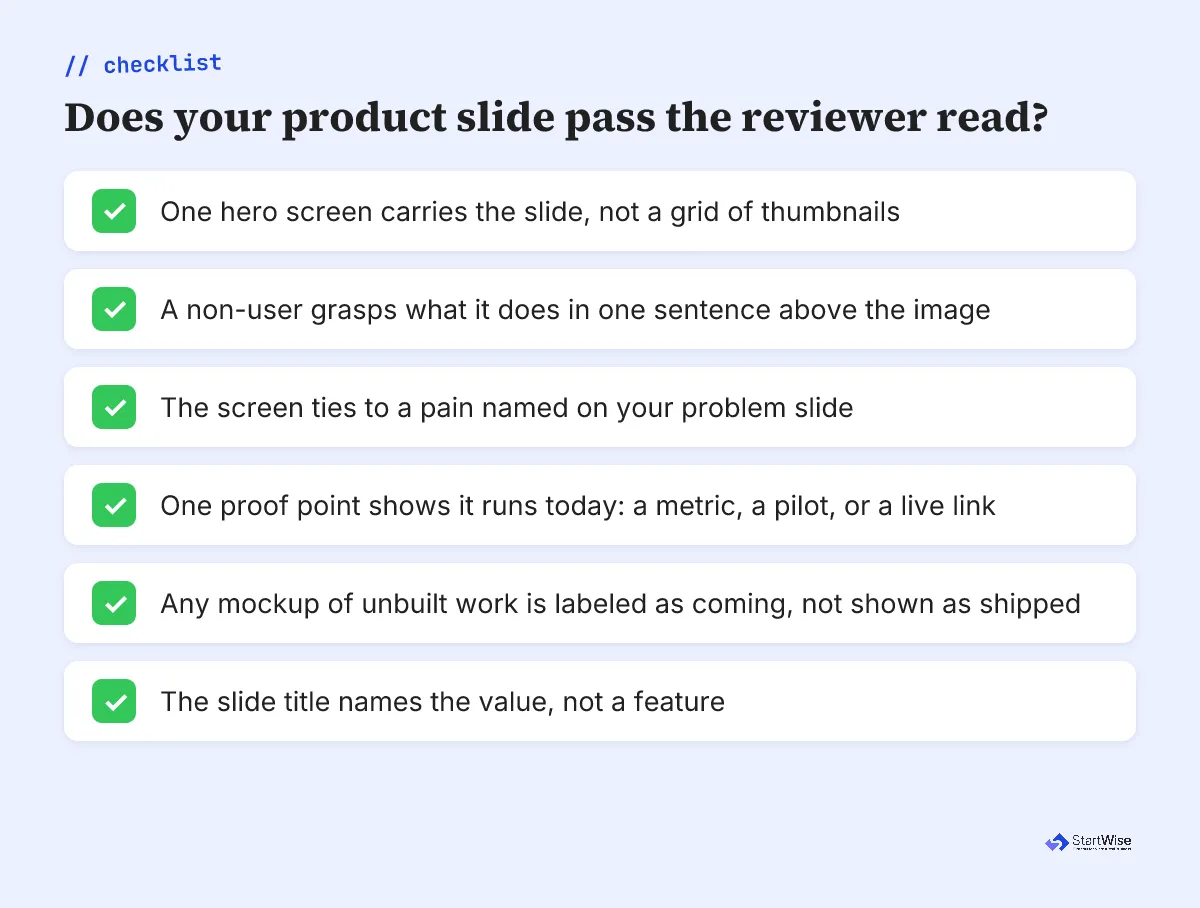
Open your current product slide and count the screenshots. More than two and you’re touring. Here’s the fix, in order.
- Cut to one hero screen: the single view where a first user gets value. Delete the rest.
- Write one sentence above it that a non-user understands, tied to your problem slide.
- Add one proof point: a live metric, a pilot, or a demo link that shows it runs today.
- Swap any polished mockup of unbuilt work for a real screenshot, even a rough one.
- Read the slide title alone. If it names a feature instead of the value, rewrite it.
The decks that clear our review fastest do exactly this. A product slide earns its place the second a reviewer thinks, so it’s real, and it does that with one screen. Everything else is a tour, and you already know how little time a reader has to sit through one.