
 By
By 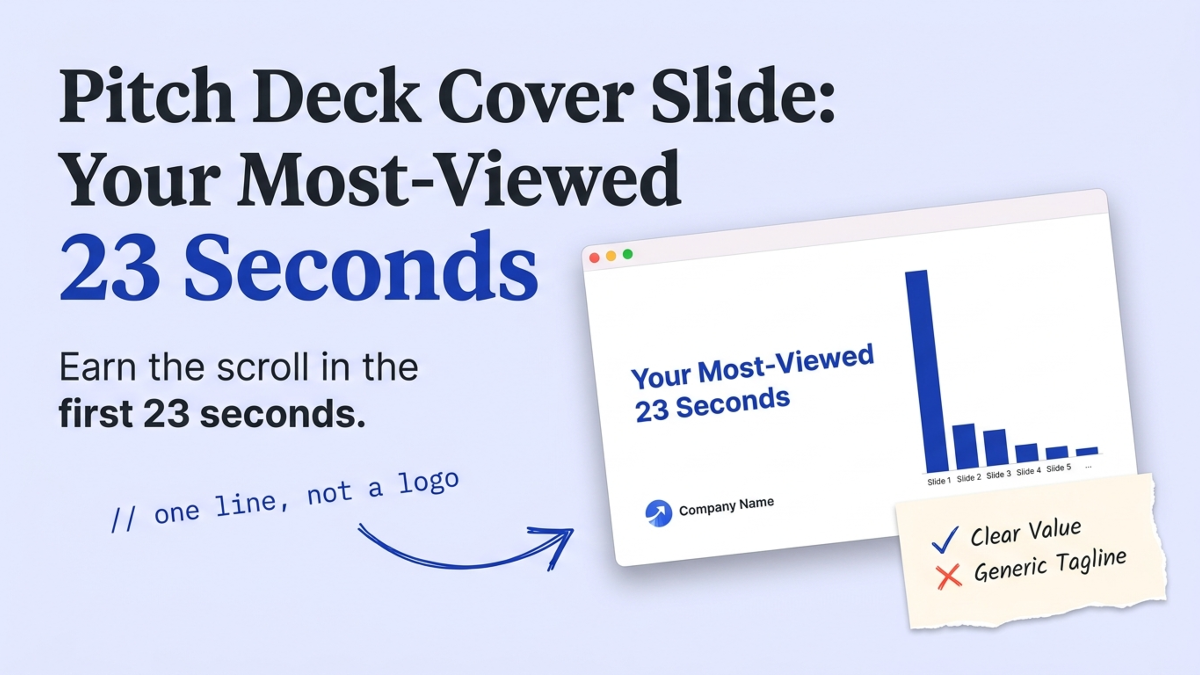
The cover slide is the first slide of your pitch deck, the one on screen before an investor reads a word of your story. It carries your company name, one line on what you do, and how to reach you. It’s also the most-viewed slide you’ll ever build: Papermark’s 2024-2025 analysis of 3,000 decks clocks 23 seconds on the first page, more than any slide after it. We review decks every week, and this is the one founders treat as a formality. It has one job. Earn the scroll to slide two.
What is a pitch deck cover slide, and why does it matter?
A cover slide matters because it’s the one slide every investor actually sees, and it decides whether they keep reading. Papermark found the first page holds attention for 23 seconds while every later slide averages about 15 (Papermark, 2024-2025). That gap is the whole point. Your cover isn’t a formality, it’s the widest funnel in your deck, wider than any of the other slides after it.
In the review room we keep seeing the same trade. Founders pour design hours into the traction slide and slap a logo on the cover. Backwards. Because of the order investors read in, the cover does more work than any other slide, since it decides who reads the rest at all.
More than half of readers never reach the end. Papermark’s 2026 Fundraising Report, built on 24,541 decks, found fewer than half of investors who open a deck make it to the final slide. So the cover can’t only look nice. It has to say enough that a skimming investor wants slide two.
What should a pitch deck cover slide include?
A cover slide should include four things: your company name and logo, a one-line description of what you do, your funding round with a current date, and one line of contact detail. That’s it. Everything else competes with the one message that matters.
Most guides stop at name, logo, tagline. BaseTemplates tells founders they have about 7 seconds to earn interest and to keep the slide under ten words. VIP Graphics leans on the serial-position effect, the bias where people remember the first and last items in a series best and the middle worst. Both are right about brevity. Both skip the part that turns a skim into a read.
Here’s what a fundable cover carries, in priority order:
- A one-line description of what you do and for whom, in plain words a non-investor grasps
- Company name and logo, sized to read, not to dominate
- The round and a current date (Pre-Seed, September 2026), signaling a live raise
- One contact line: founder name and email, nothing more
The covers we rewrite in review rarely change their design. They change what the main line says.
| Element | Weak cover | Fundable cover |
|---|---|---|
| Main line | Clever tagline or mission | One line on what you do, for whom |
| Visual | Stock photo or busy collage | One clean product image or plain field |
| Signaling | No round, no date | Round plus current month |
| Contact | Missing, or a full team list | Founder name and email |
How long do investors spend on your cover slide?
Investors spend about 23 seconds on your cover slide, then roughly 15 on each slide after (Papermark, 2024-2025). That first number sounds generous until you watch what happens inside it. Papermark’s 2026 report found 16% of investor views end within ten seconds. A sixth of the people who open your deck bail before they’ve finished the cover.
So the cover carries real stakes.
If those first seconds don’t land what you do, you’ve lost a chunk of your list before slide two ever loads.
16%
of investor deck views end within the first ten seconds (Papermark 2026 Fundraising Report, 24,541 decks)
So we tell every founder the same thing: front-load. The one message you’d keep if you could keep only one goes on the cover, in words your least technical friend would understand. The wordplay can wait for the company you build after you raise.
A cover slide that makes an investor guess what you do is a 23-second coin flip you chose to lose.
Not sure your cover earns the scroll? See how a reviewer reads it, slide by slide.
Why a logo and a tagline don’t earn the scroll
A logo and a tagline don’t earn the scroll because neither one tells a skimming investor what you actually do. “Reimagining how teams move” is a mood. “Payroll for construction crews” is a company. When we flag a cover in review, it’s almost always because the clever line won and the clear line lost.
This is our honest position after reading decks daily: at pre-seed, a cover slide without a one-line description of what you do is a bug, not a style choice. A mood board buys you nothing in the 23 seconds you get.
StartWise's position
Decks die in the first 90 seconds of a skim. Build the cover for the skimmer who reads only titles: one plain line on what you do beats any tagline, every time.
The formula that survives review is boring, and it works: what you make, for whom, that does the one valuable thing. “AI notetaker for clinicians that writes the visit summary.” A reader knows the category, the customer, and the payoff before they hit your solution slide. Clever comes later, on a slide where it earns its keep.
Does your cover slide change from pre-seed to seed?
Your cover slide changes less than the rest of your deck between stages, but the emphasis shifts. At pre-seed, the cover’s job is pure positioning. Say what you do so an investor who’s never heard of you gets it in one read. You have little traction, so don’t fake it here.
By seed, we expect the cover to carry a hook. A single proof point under the one-liner, like “$40K MRR, up 18% last month,” earns the scroll harder than positioning alone. That’s not vanity signaling. Papermark’s 2026 data shows decks that closed a round drew 36 minutes of total reading versus 18 for the median (Papermark, 2026). More reading follows a cover that promises a payoff, and by seed you’ve earned one.
Whatever the stage, keep the round and date current. A cover reading “Seed, 2024” on a deck you send in 2026 tells an investor the raise has been open a long time, and that’s the last thing your first slide should say. This holds across a standard nine-slide deck or a longer one.
What to do this week
The five-second test we run is simple: put your cover on a screen, then look away for a beat. If you can’t repeat what the company does, neither can an investor. Here’s the fix, in order:
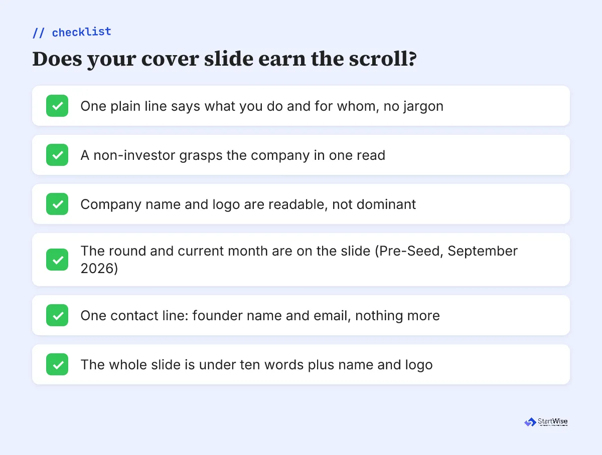
- Replace your tagline with one plain line: what you make, for whom, and the one valuable thing it does.
- Cut the cover to under ten words plus your name and logo. If a word isn’t earning its place, delete it.
- Add your round and the current month, plus one contact line: founder name and email.
- Show it to someone outside your industry. If they can’t say what you do, rewrite the line, not the design.
- At seed, add one proof point under the line; at pre-seed, leave it as clean positioning.
Your cover slide has 23 seconds and one job. Spend them earning the scroll, not decorating the wait.