
 By
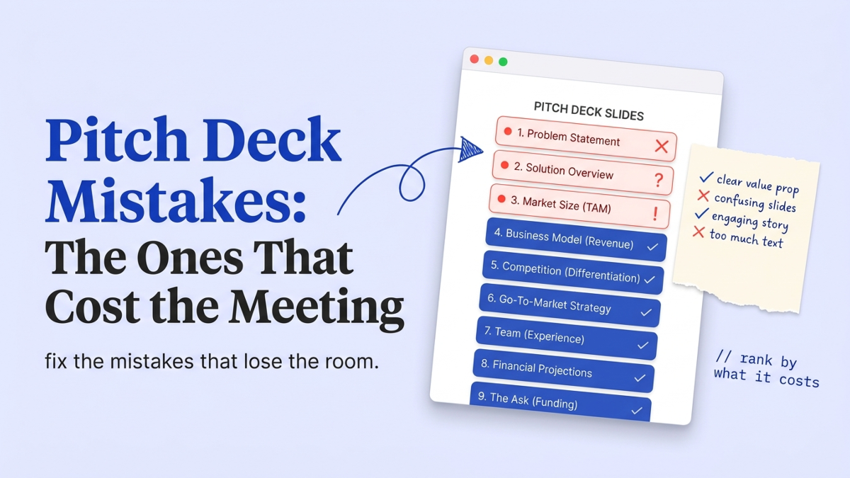
Most pitch deck advice hands you a flat list of fifteen mistakes and calls it a day. That framing is itself a mistake, because the fifteen are not equal. A cold deck gets about 2 minutes 31 seconds of attention, and only 3-5% of cold decks convert to a meeting (DocSend). In the decks we review, the ones that lose that meeting rarely lose it on design. They lose it on a handful of slides where the argument is thin, the flip side of what investors look for in a pitch deck. So let’s rank the mistakes by what they actually cost, and fix the expensive ones first.
What is the most common pitch deck mistake?
The most common pitch deck mistake is building the deck for a room you are not in. Founders write for the version where they stand up, click through, and narrate. Most investors read the deck alone first, on a phone, deciding in a couple of minutes whether to reply. Papermark’s analysis of roughly 3,000 decks put the average read at 3.2 minutes, with the first page getting more than twice the attention of any other.
That single wrong assumption produces the visible mistakes. Walls of text make sense when you’re talking over them and fall apart on a silent skim. A clever build-up that needs three slides of setup dies when the reader bounces after slide two.
StartWise's position
Decks die in the first 90 seconds of a skim. After reviewing decks daily, our take is that you should build for the skim first and the live pitch second. If reading only your slide titles tells the story, you pass. If the titles are labels like "Traction" and "Market," the reader has to open every slide to learn anything, and cold readers won't.
Fix this one and half the others fix themselves.
Write each slide title as the point of the slide, not its category. Then read the deck the way an investor does: fast, silent, alone.
Which pitch deck mistakes actually cost you the meeting?
Rank the mistakes by where investor attention goes, and the priority list writes itself. DocSend’s fundraising data shows the team slide holds attention for 62 seconds, financials for 52, and traction for 49, while the product slide gets 21. A mistake on a slide investors study costs more than a mistake on one they glance at. So a weak problem or a vanity traction number does real damage; a slightly plain product slide screenshot does not.
Here is the ranking we use in reviews, worst first.
| Mistake | Slide it hits | Why it costs the meeting | The fix |
|---|---|---|---|
| Problem nobody feels | Problem | The reader never buys the premise, so nothing after it lands | Name a specific, painful, frequent problem with one number |
| Vanity traction | Traction | Big totals with no rate read as noise, not momentum | Show the slope: week-over-week or month-over-month growth |
| Shy or vague ask | Ask | Investors can’t tell what the money buys or how long it lasts | Tie the amount to a milestone and a runway |
| TAM theater | Market | A $1T number with no bottom-up math signals hand-waving | Count reachable customers in year one, then expand |
| ”We have no competitors” | Competition | Reads as a founder who hasn’t done the homework | Map real alternatives, including the status quo |
| Rosy projections | Financials | Hockey sticks with no assumptions invite disbelief | Show the two or three drivers behind the curve |
Notice what isn’t on this list: font choice, template, animations, the exact number of slides. Those show up in every generic mistakes post. They almost never decide a raise.
Why do the problem and traction slides lose the room?
The problem and traction slides are where most decks lose the room, and they lose it early. The problem slide sets the premise for everything after it, so a weak one poisons the whole read. We keep seeing the same failure: a problem stated so broadly (“small businesses struggle with X”) that no investor feels it, or a problem invented to justify a product the founder already built. A reviewer can tell the difference in seconds, and so can a cold reader.
Your problem slide has one job: make the reader nod before they’ve seen your solution. That takes a specific person, a specific pain, and a number that shows the pain is real and frequent.
Vague empathy is not evidence.
Traction is the other early killer, and it fails in a particular way. Founders put an absolute count on the slide, a big one, and stop there. Pre-seed investors read direction and speed, not totals. Our honest take, after reviewing hundreds of these, is that traction is a slope, not a number. “4,000 signups” tells me nothing. “400 a week, up from 120 six weeks ago, with 60% coming back” tells me the mechanism works.
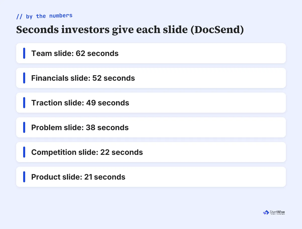
The chart above is the reason these two slides matter so much. Traction pulls 49 seconds of a reader’s attention. That’s a long time in a 3.2-minute read, and it’s where a founder either builds belief or spends it. If your traction slide shows a rate and a reason the rate holds, you’ve used those seconds well. If it shows a static leaderboard of vanity metrics, you’ve handed the reader a reason to close the tab.
The ask and financials mistakes founders keep making
The ask and financials mistakes are the most fixable expensive ones, and founders keep making them anyway. The single most common flaw we flag is a shy ask. Founders spend twelve slides building a case, then write “$500K to accelerate growth” and undo it. That’s not an ask. It’s wallpaper.
A real ask answers three questions in one line: how much, for how long, and what it buys. “$500K for 18 months of runway to reach $50K MRR and hire two engineers” is concrete enough to argue with, which is exactly what you want. Your ask slide should tie the number to a milestone that de-risks the next round. If it doesn’t, the reader has to guess, and guessing is friction.
Financials fail differently. The slide gets 52 seconds of scrutiny (DocSend), second only to the team, so investors do read it. The mistake is the hockey stick with no visible assumptions. A curve that goes up and to the right with no drivers behind it reads as a wish. Show the two or three levers that move the model, and let the reader poke at them. That’s more persuasive than a bigger number. If you’re not sure what belongs on the slide versus in the model, we broke that down in what financial model investors want.
Not sure which mistakes a reviewer would flag on your deck? Get a slide-by-slide read.
Market size and competition: swap theater for evidence
The market and competition slides fail as theater when they should work as evidence. Most market-size slides are exactly that: theater. A $1T TAM sits on the slide with no path from it to a single customer you can actually reach. Investors have seen a thousand of those. Build the market slide bottom-up instead: how many reachable customers exist in year one, at what price, and how you’ll get to them. We walked through the arithmetic in this TAM SAM SOM example.
A napkin-proof count of reachable customers beats a made-up trillion-dollar market every time.
Competition is the other self-inflicted wound. “We have no competitors” is the fastest way to tell an investor you haven’t looked. Everyone has competition, and the status quo (a spreadsheet, doing nothing, a manual workaround) is usually the biggest competitor of all. Name the real alternatives and say why you win against each. A candid competition slide builds more trust than a claim of empty space, because it shows you understand the market you’re entering.
Both slides share a root cause: founders treat them as boxes to fill instead of arguments to make. The fix is the same for each. Replace the generic asset with one specific, defensible claim you’d be willing to defend in a follow-up call.
What are NOT the pitch deck mistakes to worry about?
Plenty of things founders panic about are not the mistakes that matter. This is where I’ll disagree with most of the internet. Funded decks did score 38% higher on design in one study of 17,500 decks (Sequel, 2025), and every listicle uses that to tell you to obsess over polish. But that gap mostly measures clarity: readable type, one idea per slide, titles that carry meaning. It does not measure custom illustration or animated transitions.
So stop losing sleep over these:
- The exact slide count, as long as you’re in the 9 to 16 range Papermark found is normal. Slidebean’s 2025 analysis put the median funded deck at 12 slides, so there’s a wide safe band. A tight deck with a weak problem still loses to a clear one.
- One typo. Fix it, but a single error doesn’t kill a strong argument. A perfect deck with nothing to say does.
- A plain template. Legible beats fancy. Reviewers read the words, not the gradients.
- An agenda slide. Skip it or keep it. Nobody funds or passes on a table of contents.
Founders routinely spend 5 to 10 hours on a single presentation (VerdanaBold, 2025), and too much of that goes into the pixels. The hour that changes your odds is the one spent sharpening the problem statement, not the one spent aligning boxes. Design that helps is invisible. Design you notice is usually design you overdid.
What to fix this week
Open your deck and do a fast, silent read, the way an investor will. Then fix in this order, because the order is the whole point.
- Rewrite every slide title as the point of the slide, not its category. If the titles alone tell the story, your skim passes.
- Rebuild the problem slide around one specific, frequent, painful problem with a number attached.
- Turn traction from a total into a slope, and turn the ask from “$500K to grow” into an amount tied to a milestone and a runway.
- Bottom-up your market slide and name real competitors, including the status quo.
- Leave the fonts, the template, and the transitions alone until the argument is right.
Do those five, and you’ve fixed the mistakes that actually cost meetings. Everything else is polish. If you want a second read before you send it, that’s what a structured deck review is for, and it’s the same slide-by-slide pass we just walked through.